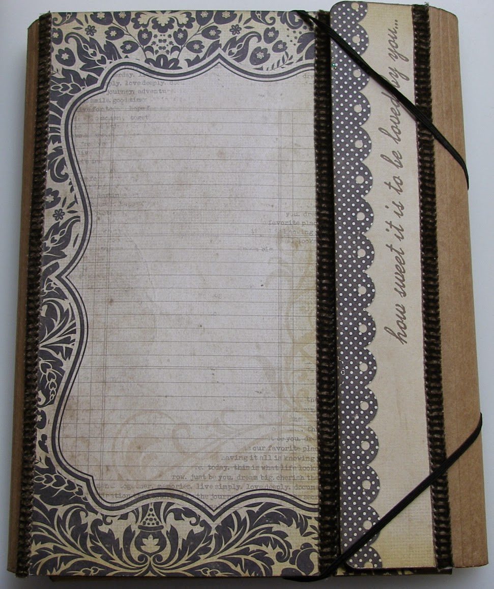
Good morning! Today we have a new challenge at Crafts 4 Eternity, which is to use a camera or photo theme or element. I have gone with a photo theme and created an album using a large Tim Holtz Collection Folio.
Warning: this is a picture heavy post.
Papers used throughout: Simple Stories ~ Documented. I have used all 18 of the papers in the collection and then I purchased a further four sheets and then used the other sides to what I had already used.
The pocket on the bottom flap was created with a Sizzix Pocket Envelope die and contains a pull-out card.
The top flap is decorated with a pocket with a pull out tab.
One side of the tab ...
... and the other side.
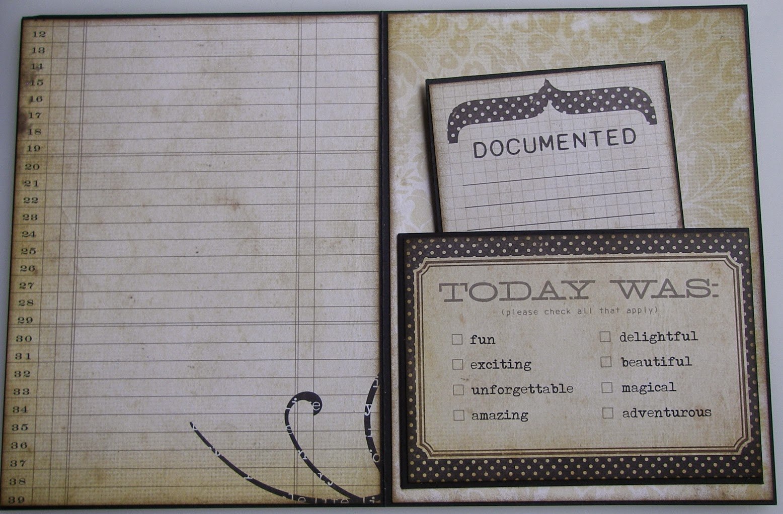
Inside bottom flap holds another pocket with a pull out card.
Inside top flap has another pocket created with the Sizzix die and contains a pull out tab.
I have decorated the tabs which come with the folio in a progressively wider way, so that they fall like a waterfall and so that you can see a peek of each layer underneath.
I decorated all of the pages, before I added the entire piece to my folio. For each of the tabs (except for one), I created a pocket, by sticking card to each side of the tab and then sealing across the bottom, along the stitched area and up the sides. The first tab is just a short piece and contains four pull out mini cards, two of which open up. You can see the detail of these cards on my youtube video.
The second tab is a bit larger and has been made into a pocket again. I cut up some of the papers and overlapped them slightly, when arranging them on the side of each pocket. I added a decorative brad to each side also.
The pocket has a little pull out booklet, consisting of four sides, each of which is decorated with paper.
The other side of the tab.
For the third tab, I have just decorated each side with a shorter piece of black cardstock and sealed them so that there is no pocket.
I've then added two pull out pieces.
And the back.
The fourth page is a larger pocket ...
... with a pull out photo mat ... front
... and back.
The other side of the pocket.
The fifth page is another pocket, again slightly larger. The front of the pocket contains another pocket with a pull out tag, which has been decorated on each side. The main pocket contains a pull out photo mat which is covered with paper on each side.
The other side of the pocket.
On the sixth and final tab, I have created an expanding pocket, containing three items.
There is an envelope, cut with a Sizzix die and contains two pull out photo/journaling mats.
Two pull out booklets have also been included inside the pocket.
These have been decorated on each side and each also contains a pull out booklet inside.
For the back cover, I changed the eyelets which were in there and replaced them with some nicer ones.
I've added one final pocket with a pull out photo mat.
I am entering this in at the following challenges:
- focus on sentiment ~ City Crafter
- twine ~ Creative Card Crew
Thank you for looking.
Keeley


